

Getting Started with Plotly for R
Plotly 서비스의 코어 부분인 Plotly.js가 오픈소스화 되었습니다. 그 영향으로 로컬 환경에서 plotly를 이용해 인터렉티브 차트를 그릴 수 있게 되었습니다. 파이썬 등 다른 언어를 통해서도 지원하지만, R의 경우 ggplot2와의 호환성이 높다는 것이 큰 특징이라고 할 수 있습니다.
R의 plotly 패키지는 plotly.js를 htmlwidget을 이용해 그래프를 처리합니다. 따라서 다른 htmlwidget기반 패키지들과 마찬가지로 윈도우에서는 한글 출력시 인코딩 문제가 발생할 수 있습니다.
자세한 사용법은 홈페이지 에서 확인할 수 있습니다. 여기서는 정말 간단한 맛보기 정도로만 보여드리려고 합니다.
이 페이지에서는 이미지 형태의 차트로만 보여드립니다
library(dplyr)
library(plotly)
library(ggplot2)
기본적으로 plot_ly 함수를 사용해서 그래프를 출력합니다.
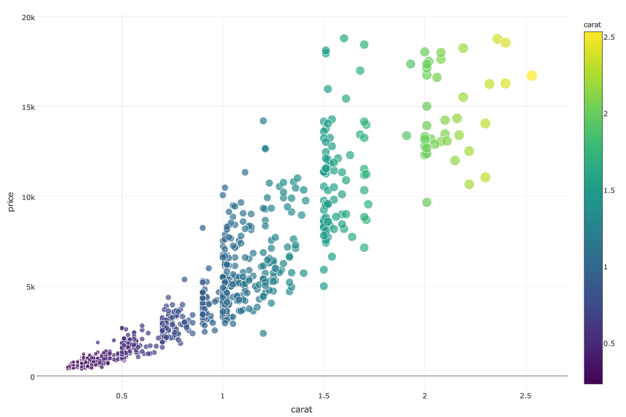
아래 그래프는 ggplot2 패키지의 diamonds 데이터를 이용해서 그린 산점도입니다.
set.seed(100)
d = diamonds %>% sample_n(1000)
plot_ly(d, x=carat, y=price,
        text = paste("Clarity :", clarity),
        mode = "markers", color = carat, size = carat)
이번에는 국가 기후 데이터 센터 에서 받은 지역/시간대별 온도/습도 자료를 이용해서 서울과 부산의 온도를 선 그래프로 그려보았습니다.
weather = readr::read_csv('../dataset/0701_0813_data.csv')

weather_subset = weather %>%
  filter(location %in% c('서울', '부산')) %>%
  mutate(location = ifelse(location == '서울', 'Seoul', 'Busan')) %>%
  group_by(location, date) %>%
  summarise(temp = round(mean(temp), 1)) %>%
  ungroup()

weather_subset
## Source: local data frame [88 x 3]
##
##    location       date  temp
##       (chr)     (date) (dbl)
## 1     Busan 2015-07-01  22.4
## 2     Busan 2015-07-02  22.2
## 3     Busan 2015-07-03  23.1
## 4     Busan 2015-07-04  21.4
## 5     Busan 2015-07-05  21.3
## 6     Busan 2015-07-06  21.1
## 7     Busan 2015-07-07  19.5
## 8     Busan 2015-07-08  20.7
## 9     Busan 2015-07-09  23.1
## 10    Busan 2015-07-10  23.8
## ..      ...        ...   ...
plot_ly(weather_subset, x = date, y = temp, color = location,
        colors = "Accent")

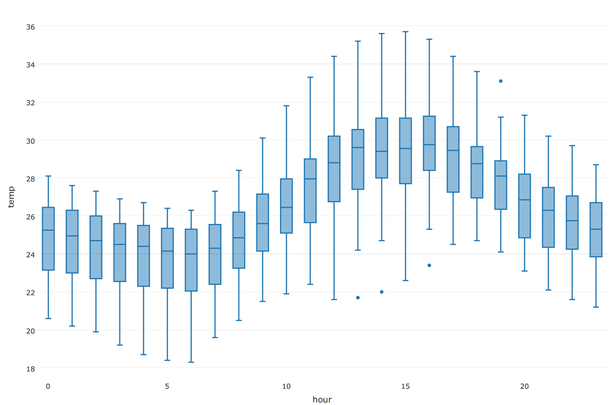
동일한 데이터로 서울의 시간대별 온도를 box plot으로 그려보았습니다
seoul_weather = weather %>%
  filter(location == '서울')

seoul_weather
## Source: local data frame [1,056 x 6]
##
##       id location       date  hour  temp precipitation
##    (int)    (chr)     (date) (int) (dbl)         (dbl)
## 1    108     서울 2015-07-01     0  22.2           0.0
## 2    108     서울 2015-07-01     1  22.1           0.5
## 3    108     서울 2015-07-01     2  21.9           0.0
## 4    108     서울 2015-07-01     3  21.8           0.0
## 5    108     서울 2015-07-01     4  21.7           0.0
## 6    108     서울 2015-07-01     5  21.4           0.0
## 7    108     서울 2015-07-01     6  21.0           0.0
## 8    108     서울 2015-07-01     7  21.1           0.0
## 9    108     서울 2015-07-01     8  22.2           0.0
## 10   108     서울 2015-07-01     9  23.3           0.0
## ..   ...      ...        ...   ...   ...           ...
plot_ly(seoul_weather, x= hour, y=temp,
        type = "box")
ggplot2 패키지에서 생성한 그래프 객체를 이용해서 plotly 그래프를 생성할 수 있습니다.
먼저 아래와 같이 ggplot2 그래프 객체를 생성합니다
seoul_gg = ggplot(seoul_weather, aes(x = hour, y=temp))+
  geom_point(colour = "#90c8c6")+
  stat_smooth()

seoul_gg
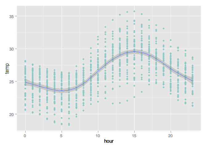
ggplotly함수를 이용해서 plotly 그래프로 변환시킬 수 있습니다
ggplotly(seoul_gg)